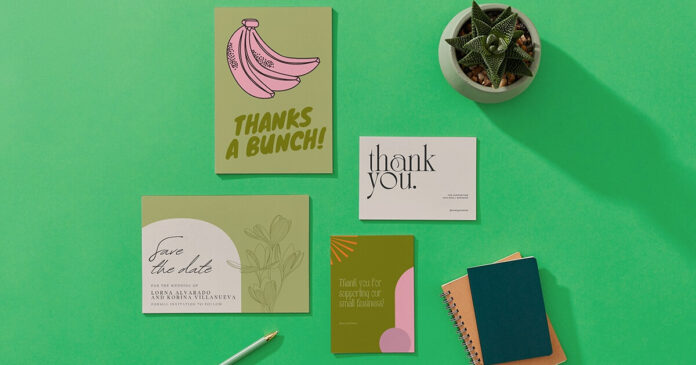
Unless your postcards are eye-catching, they may be in the trash or ignored. This is especially true if they have misspellings or other mistakes that tarnish your business image.
To make sure that this never happens to you, the most basic step is to use a postcard template, and further improve it with these steps:
1. Use a Catchy Headline
A great headline is essential to grabbing attention on a postcard. Postcards get skimmed quickly and often, so a catchy, compelling headline will lure people in to take a closer look.
Use adjectives that appeal to the reader, such as free, fun, easy, essential, or powerful. Using a curious or exciting word in the headline can also help, sparking curiosity and making the reader want to find out more.
Knowing what you want the recipient to do next is also important. Whether that’s to contact you, visit your website, or go into the store, it should be evident in the postcard’s text. Providing one clear next step can help prevent what’s known as “decision fatigue” and encourage people to take action.
A big, eye-catching headline, a short line of offer copy, and a clear call to action are perfect for most postcards. Avoid adding too many design elements that distract from the message, and leave plenty of white space to keep it open and direct.
2. Make Your Copy Stand Out
Postcards are a great way to tell your story and draw attention to your business. But, a well-crafted message and beautiful images are enough to grab people’s attention if presented compellingly.
Your postcard needs a clear call to action that motivates people to act. That means a direct offer, like “refer a friend” or “get 40% off.” This call to action should be easily understood and positioned prominently.
Make sure your copy stands out using large, bold text and keeping it short. It’s also important to remember that most recipients scan their mail. Large blocks of text can be challenging to read, so consider using bullet points or breaking up large areas of copy into smaller sections.
If you want to add a touch of visual flair with your cheap postcard printing, try using spot UV, foil blocking, or unique die cuts. These finishing touches can give your postcards a unique look and feel, which will help to set them apart from other marketing materials and attract more customers.
3. Add a Personal Touch
A personal touch makes postcards stand out from the rest of the mail and can also help boost your brand’s trustworthiness. Incorporate testimonials and images of happy customers to show that your company is a legitimate business that cares about its clients.
Postcards are usually mailed with the back side facing up, so add engaging text on the back to entice readers. You can also experiment with different fonts and sizes to find the ones that best fit your message. Just make sure to choose a legible font that fits your audience—some fonts can look outdated or childish, while others may be difficult for viewers to scan.
Since space is limited on a postcard, make sure your message is concise. Including too much information can overwhelm the news and turn off readers. Using powerful words and an action-oriented copy is essential for recipients to follow through on your call to action. Be sure to include your contact information so recipients can reach out if they need more information or assistance.
4. Use a Neutral Background
The background of a postcard can be just as necessary as the images and text. Using a neutral color for your experience is a good idea to make it easier for your text and pictures to stand out. Stronger colors can overwhelm the eyes and create a visual overload.
Choosing a background that meshes with your business or event is also a good idea. For example, if you’re hosting an antique sale, consider using a clean and sleek image that reflects the theme of your event. Add a tint, drop shadow, or highlight feature to your text to customize its look.
Next, you’ll want to add any necessary graphics. To do this, hover over the left vertical icon menu and click Graphics. This will allow you to upload an image from your computer or browse BeFunky’s wide selection of graphic elements. Remember to keep the number of graphics minimal, as too many can clutter your postcard and distract from the message you’re trying to convey.
5. Leave Some White Space
Leaving some white space in your postcard printing can help direct the eye of the viewer and make it easier for them to read. White space can be defined as any area not occupied by text, photos, or other elements in your design. This space can be used to break up a large block of copy and make it easier to read, or it can be used to highlight essential elements such as a call to action.
Using proper color shadings can also be effective in directing the eye. For example, a bold red may inspire excitement, while a more excellent shade like green might suggest a natural feel. If your postcard is for a new product or service, highlighting it with a photo showing faces can help people associate a look with the brand and create trust.
Read Also: Listing the Best Ways to Make Money in Real Estate
Postcards are meant to grab attention and encourage a response, but it’s easy to go overboard with too much information and turn off recipients. Be sure to use simple, eye-catching designs and focus on one main message per postcard to avoid overwhelming your audience with too many details.


